
Design of the Month
General Guidelines for Selecting Design of the Month
1. Creativity:
Designs that break the mold with fresh, artistic concepts, engaging viewers through unique execution.
2. Innovation:
Designs that communicate messages in novel, unexpected ways, using creative layouts, typography, and imagery.
3. Impressions:
Designs that leave a memorable impact with their elements and create a lasting connection.
4. Adherence to Branding:
Designs that seamlessly blend creativity with established branding guidelines as per the Toastmasters International brand manual.
Note:
- The Design of the Month contest aims to acknowledge outstanding designs while recognizing that assessing design involves some subjectivity. Our selection process balances objective evaluation with an appreciation for the artistic and communicative aspects of the designs based on the above parameters.
- The panel comprises Niteash Agarwaal, DTM ( Regional Advisor Region 13), Neha Bhatt, DTM ( Past District PRM – District 98), Sahrish Jahan, DTM ( District PRM – District 92), Sai Charan Singh ( District PRM – District 126) and Sanjay R ( District PRM – District 98)
- The contest encourages VPs PR to elevate their design skills for enhanced PR and Marketing. To ensure fairness and opportunities for more VP PR, a previous winner cannot win again. However, past winners can submit entries for special mentions and to inspire others.

Meet Every Sunday, 10.30 AM to 12.30 PM at Baroda Management Association In-Person
Winner of Design of the Month February 2024
Thought behind flyer by VPPR Kabir Brahmbhatt:
While planning this design, I was inclined towards giving the poster a minimalistic look, so I kept the Toastmasters-grey background.
I contemplated the words “Tools” and “Leaders” to add the creatives which could add more meaning and send the message to the viewer.
I added 2 Gears in place of Os signifying Tools and a step-up ‘leading’ ladder in place of E which ‘leads to the top’.
The colors chosen were brand-compliant, in contrast to the grey background.
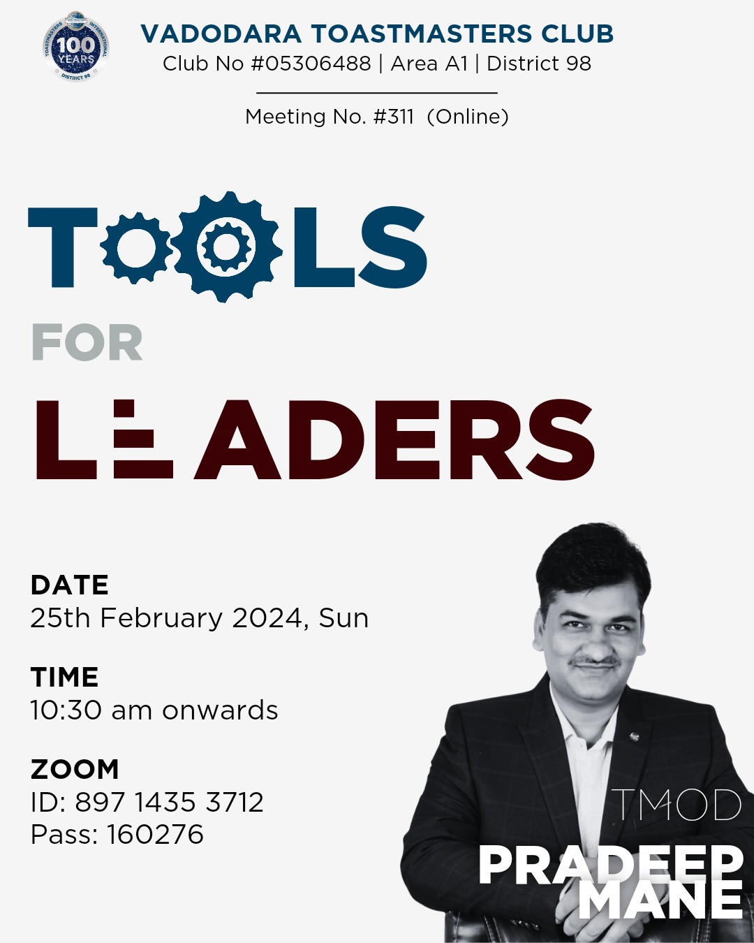
Why and based on Which Criteria Flyer Was Selected
The flyer was selected based on its excellence in three key areas in comparison to other submitted entries:
Creativity: The flyer effectively merges tools and the ascent of leaders, crafting a dynamic visual narrative.
Innovation: The flyer effectively incorporates gears and steps for tools and leaders letters O and E respectively.
Impressions: The flyer makes the viewer pause and engage with the flyer content due to the visual contrast of colors, one can find all the required details about the meeting.
Moreover, the flyer adheres to the branding guidelines outlined in the branding manual.

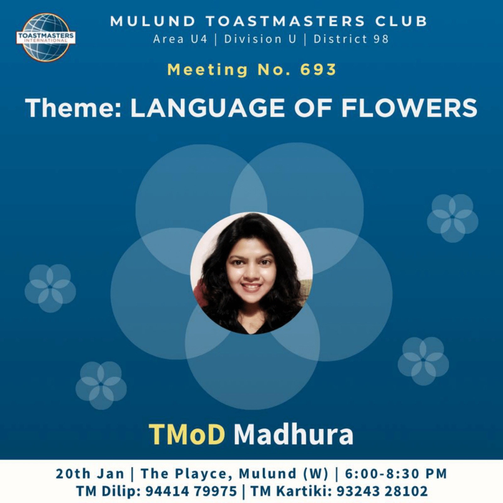
Special Mention under Innovation Design Category
Special Mention under Creativity Design Category
Special Mention under Impression Design Category
Special Mention under Innovation Design Category
Special Mention under Creativity Design Category
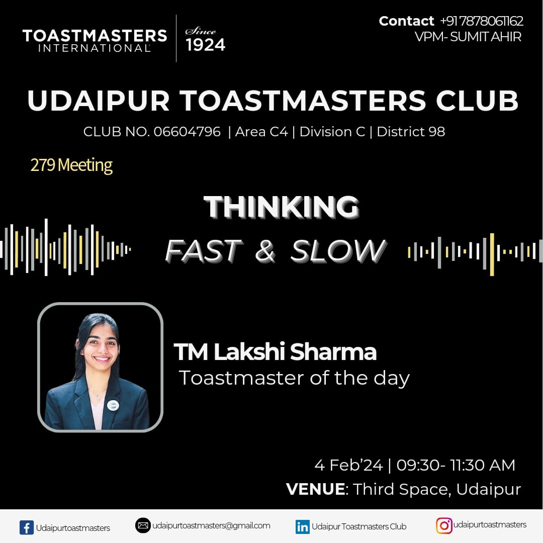
Special Mention under Impression Design Category

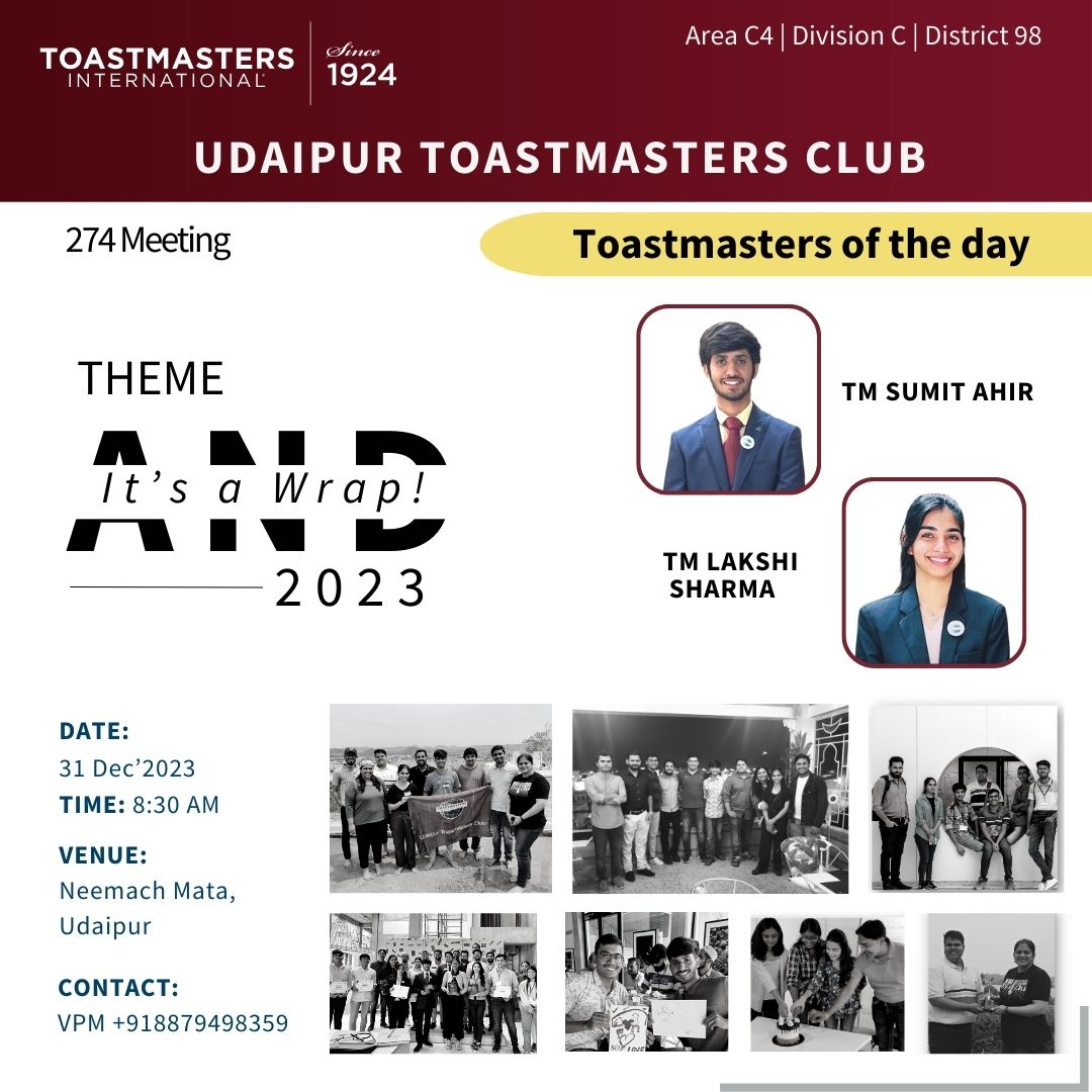
Special Mention under Innovation Design Category
Special Mention under Creativity Design Category

Special Mention under Impression Design Category
Special Mention under Innovation Design Category
Special Mention under Creativity Design Category
Special Mention under Impression Design Category
Meet Every Sunday, 10:30 AM-12:30 PM in person
Winner of Design of the Month October 2023
Thought behind flyer by VPPR Meghana Mehta:
I visualized the theme of sports with sports grounds.
During school days, I used to play basketball and I tried incorporating that ground with basic shapes with compliancy.
Finally, I was able to make a flyer that gives the feeling of sports with basic Geometrical shapes.
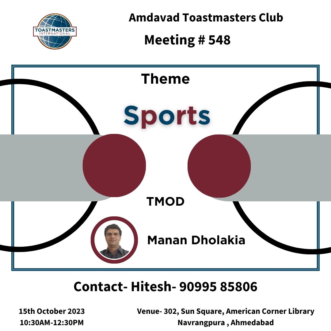
Why and based on Which Criteria Flyer Was Selected
The flyer was selected based on its excellence in three key areas in comparison to other submitted entries:
Creativity: The flyer effectively conveys meeting details by preserving the creativity of the sports ground design in a subtle way.
Innovation: The flyer effectively uses geometrical shapes within the boundaries of compliance and depicts on point what the theme is.
Impressions: The flyer makes the viewer pause and engage with the flyer content, one can find all the required details about the meeting.
Moreover, the flyer adheres to the branding guidelines outlined in the branding manual.
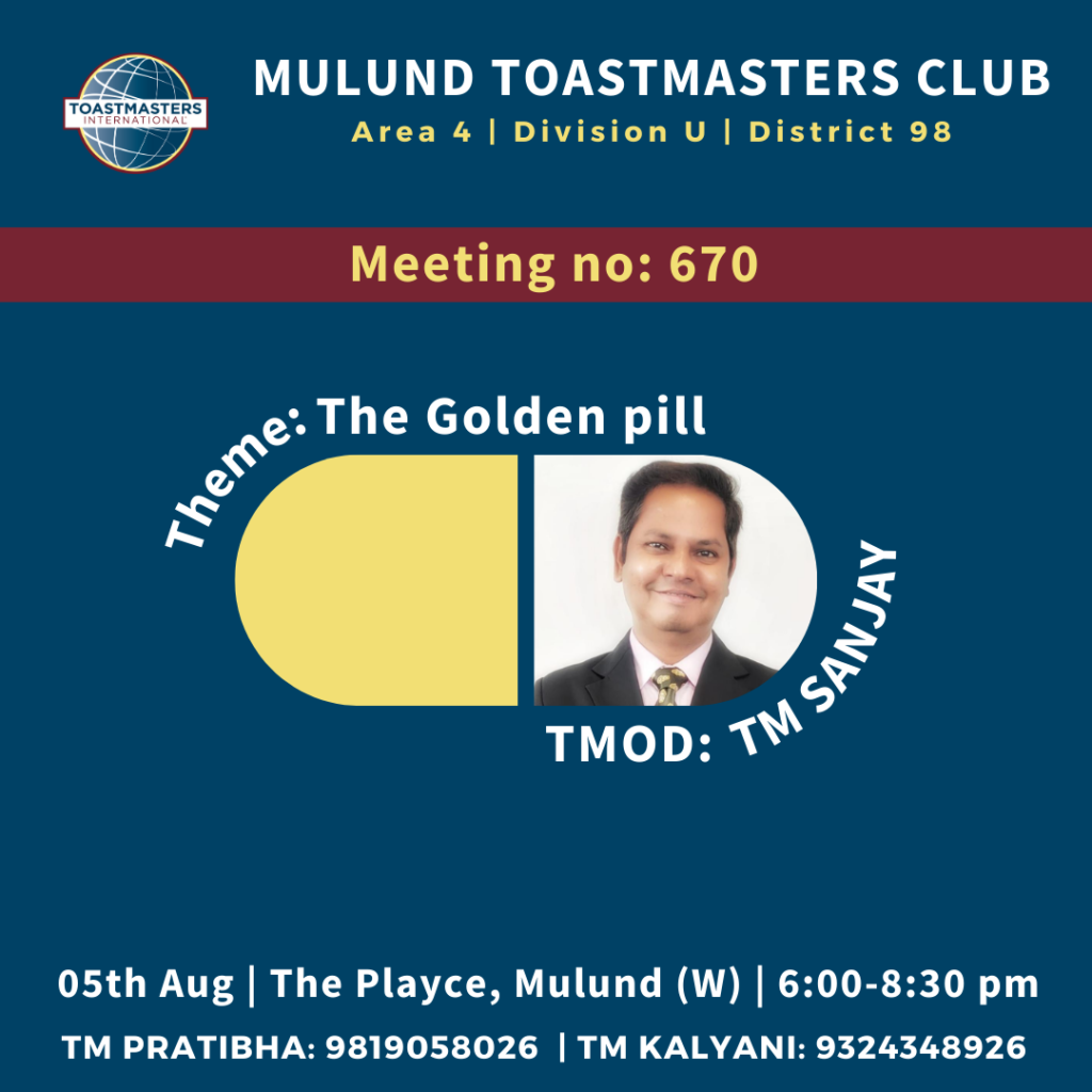
Special Mention under Innovation Design Category
Special Mention under Creativity Design Category
Special Mention under Impression Design Category

Meets Alternate Sunday in Hybrid Mode from 11 AM to 1 PM at Bahai Centre
Winner of Design of the Month September 2023
Thought behind flyer by VPPR Gauri Gurav:
As soon as I got to know about the theme “Cutting Chai”
I was excited to make the design relatable to all tea lovers.
I used two different colors for the word “Cutting” to mimic the concept of half filled tea cup. My biggest challenge was to present the idea of tea without making it the whole focus of the poster.
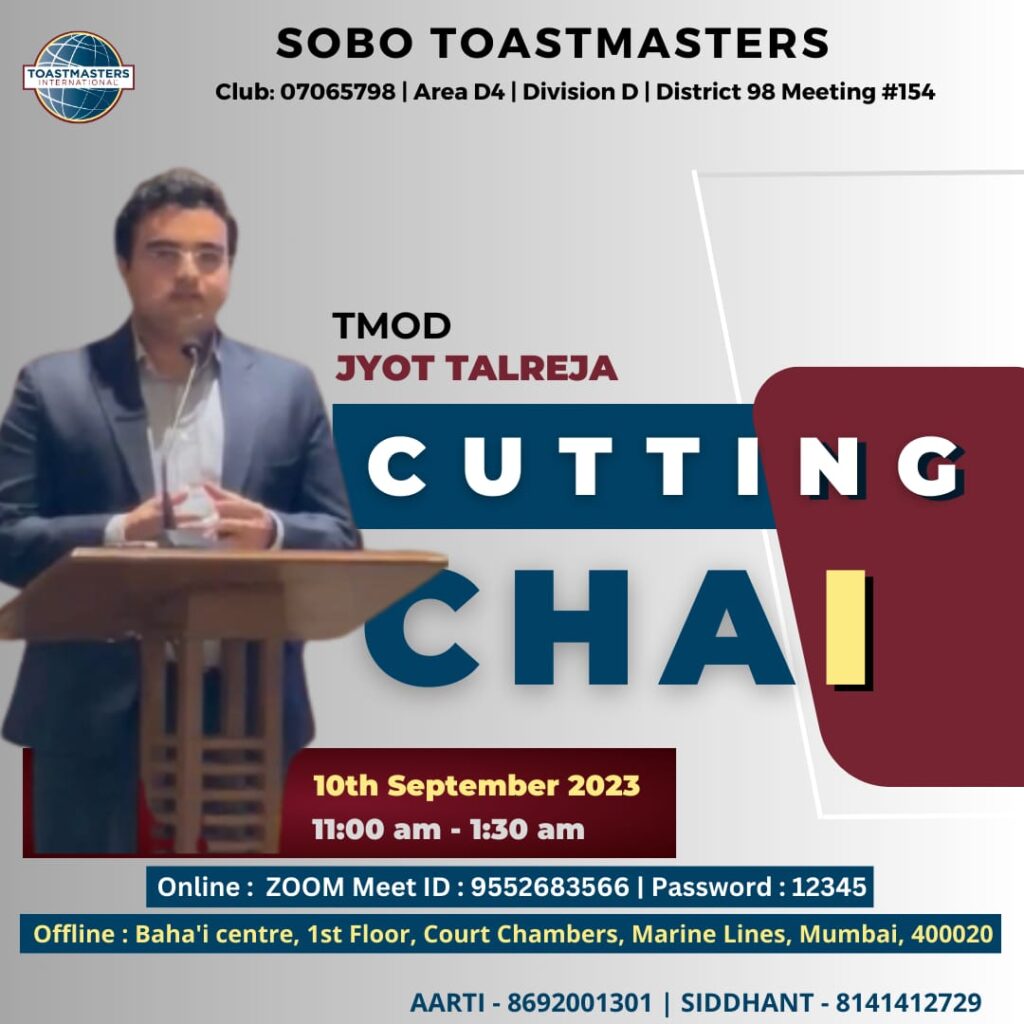
Why and on the Basis of Which Criteria Flyer Was Selected
The flyer was selected based on its excellence in three key areas in comparison to other submitted entries:
Creativity: The flyer effectively conveys meeting details in a visually understandable hierarchy while preserving the theme’s essence of cutting chai.
Innovation: The flyer effectively uses a simple yet impactful subtle shape of a chai glass half empty and the typography of Cutting Chai adds a second layer of impact.
Impressions: The flyer makes the viewer pause and engage with the flyer content, one can find all the required details about the meeting.
Moreover, the flyer adheres to the branding guidelines outlined in the branding manual.
Special Mention under Innovation Design Category
Special Mention under Creativity Design Category
Special Mention under Impression Design Category
Meets Every Sat 10.30 AM (Google Meet or offline in TCS Garima Park, Gandhinagar)
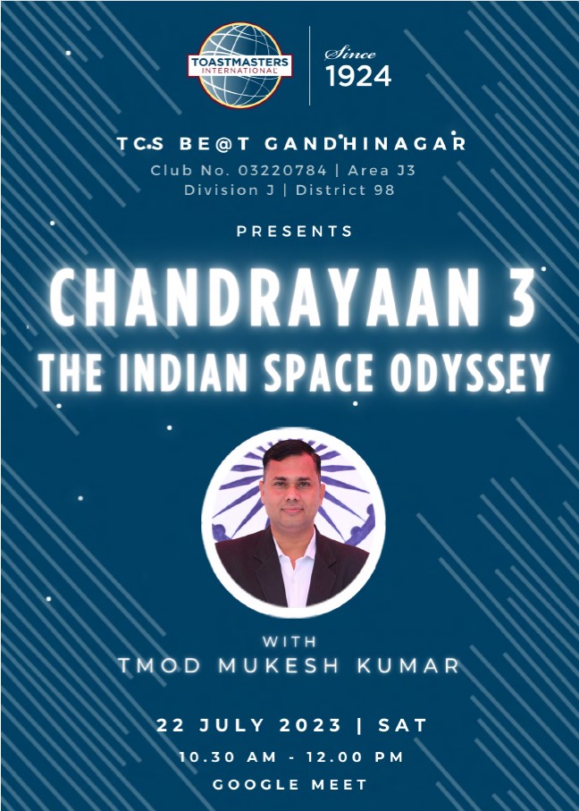
Winner of Design of the Month August 2023
Thought behind flyer by VPPR Jesal Rathore:
The aim was to create a design that could balance creativity and content to communicate effectively in the brand language of Toastmasters. As the designer, I have tried to control how to use the space and colors judiciously to give power to the content.
The design principle used in the design is hierarchy and balance. The thought behind the design was to maintain a visual hierarchy and balance to enhance the content in the design. The division of the space gives the idea about the two parts of the meeting to the audience. The visual elements and patterns used are to highlight the speakers and details of the meeting.
Why and on the Basis of Which Criteria Flyer Was Selected
The flyer was selected based on its excellence in three key areas in comparison to other submitted entries:
Creativity: The flyer effectively conveys meeting details in a visually understandable hierarchy while preserving the theme’s division into two different aspects.
Innovation: The flyer effectively uses a simple yet impactful white and maroon scheme with compliant photography suiting the vibe of the poster.
Impressions: The flyer makes the viewer pause and engage with the flyer content.
Moreover, the flyer adheres to the branding guidelines outlined in the branding manual.
Special Mention under Innovation Design Category
Special Mention under Creativity Design Category
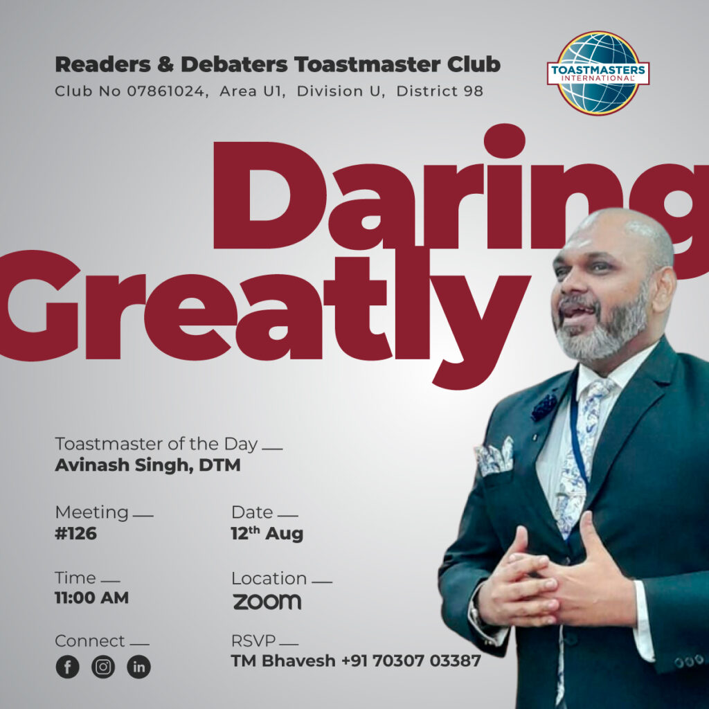
Special Mention under Impression Design Category

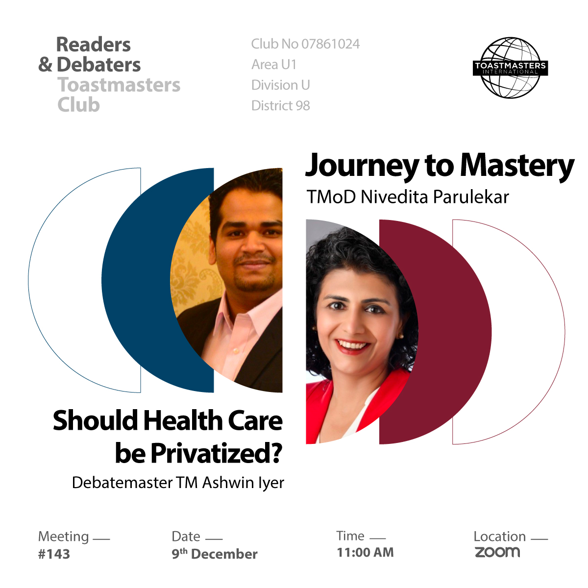
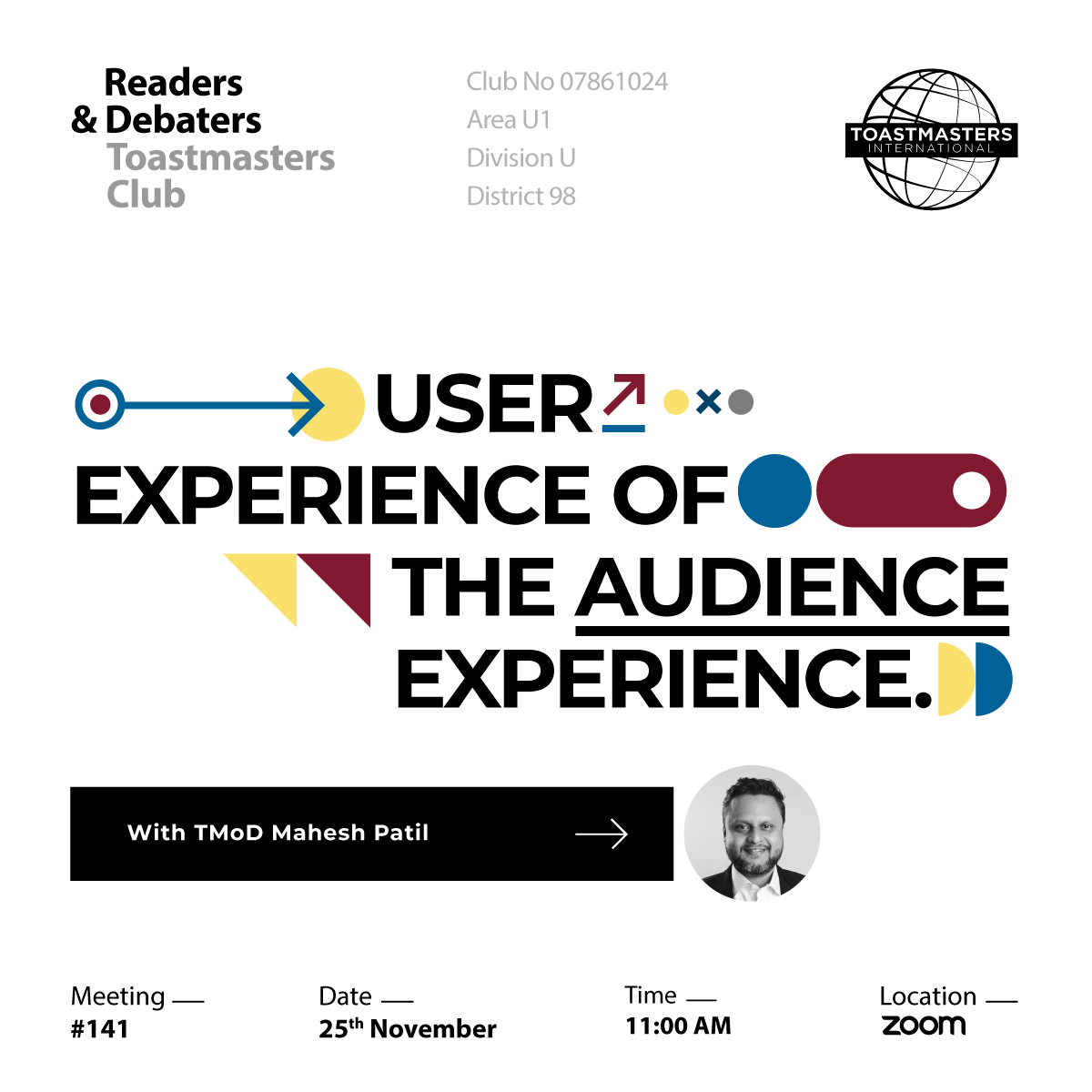
Readers and Debaters Toastmasters Club
Meets Every Saturday 11 AM Onwards over Zoom
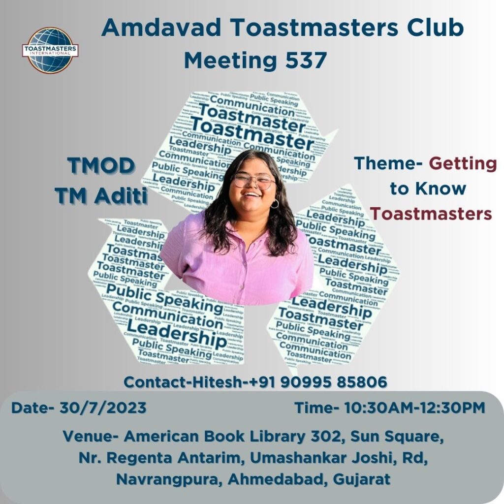
Winner of Design of the Month July 2023
Thought behind design by Designer of July Month – Mahesh Patil:
In my humble vision, I imagine a world where Toastmasters are not constrained by physical barriers. Instead, we boldly embrace technology to connect with individuals from all corners of the globe. We become the pioneers of online speaking, inspiring and empowering others to find their voice and share their stories.
With this in mind, I have created a digitally manipulated photo that encapsulates this concept. It showcases a futuristic Toastmasters, where members from different cultures and backgrounds are effortlessly connected through the power of technology. This image serves as a reminder that Toastmasters is not bound by physical limitations but opens up endless possibilities for growth and self-expression.
Why and on the Basis of Which Criteria Design Was Selected
The design was selected based on its excellence in three key areas in comparison to other submitted entries:
Creativity: The integration of the Toastmaster of the Day image was executed in a highly creative manner, significantly enhancing visual appeal and adding a unique and artistic touch to the theme.
Innovation: The design effectively communicates the message about the theme and Toastmaster of the day along with meeting details in an innovative way.
Impressions: The design feels professional and its memorable impression is further enhanced by the use of a restrained color palette.
Moreover, the design adheres to the branding guidelines outlined in the branding manual.
Special Mention under Innovation Design Category
Special Mention under Creativity Design Category
Special Mention under Impression Design Category